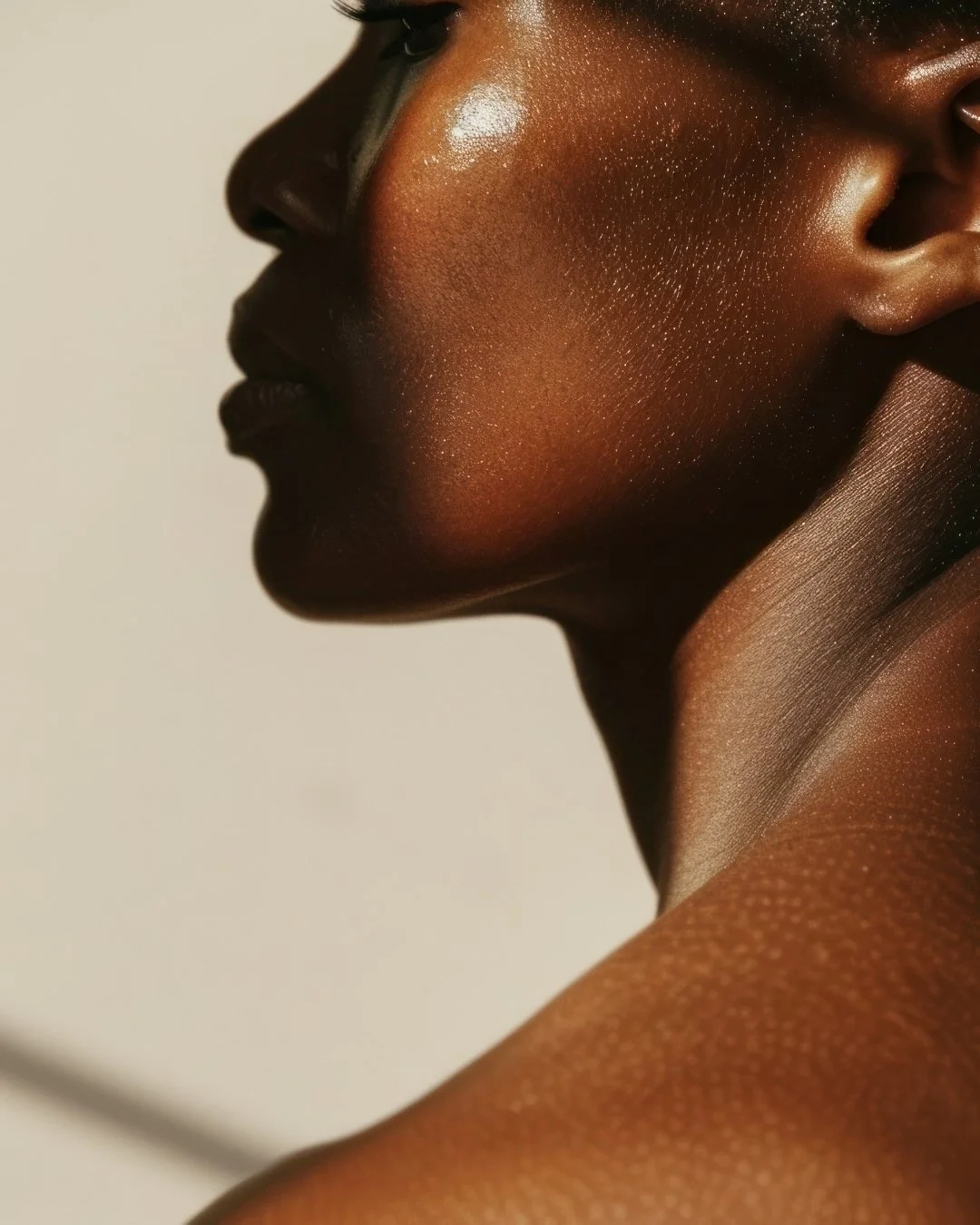
{ Brand Identity }A beauty brand's complete visual identity, built to feel as intentional as its products.
Rich Harvst had a clear sense of what the brand stood for: authenticity, natural richness, a kind of understated luxury. What it didn't yet have was a visual system capable of carrying that intention consistently across every surface it touched. A loose aesthetic isn't a brand. The work was to make the internal vision legible externally, to build something that could hold up from packaging to digital without losing what made it worth building in the first place.
Rich Harvst
( Client )Brand Identity Suite
( Service )( Timeline )12 weeks
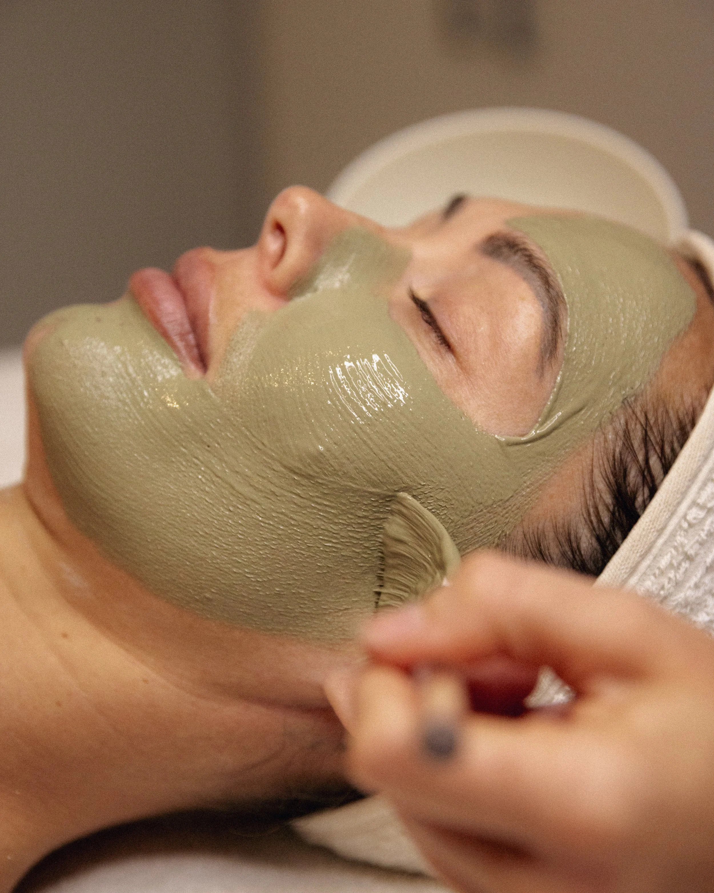
The Approach
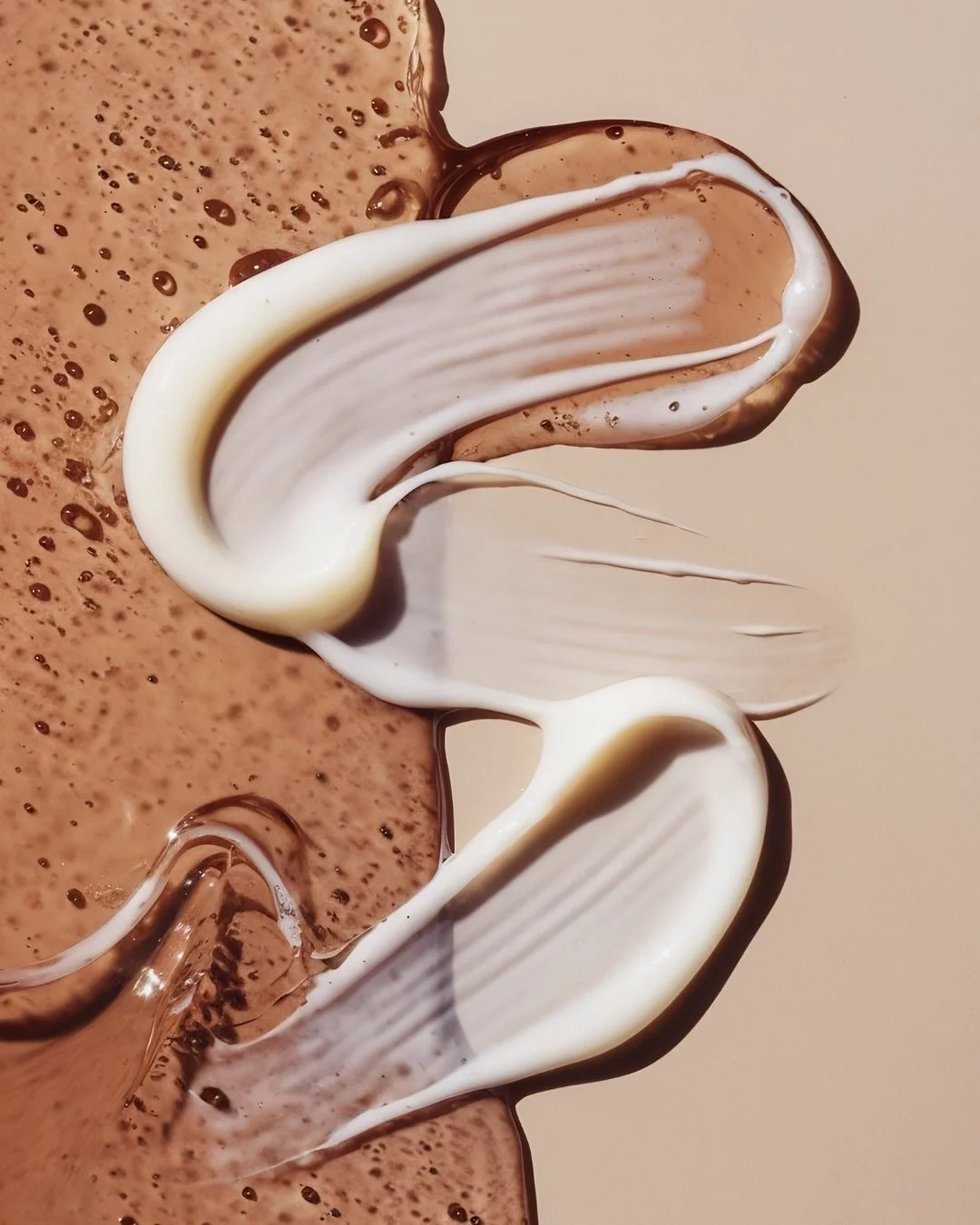
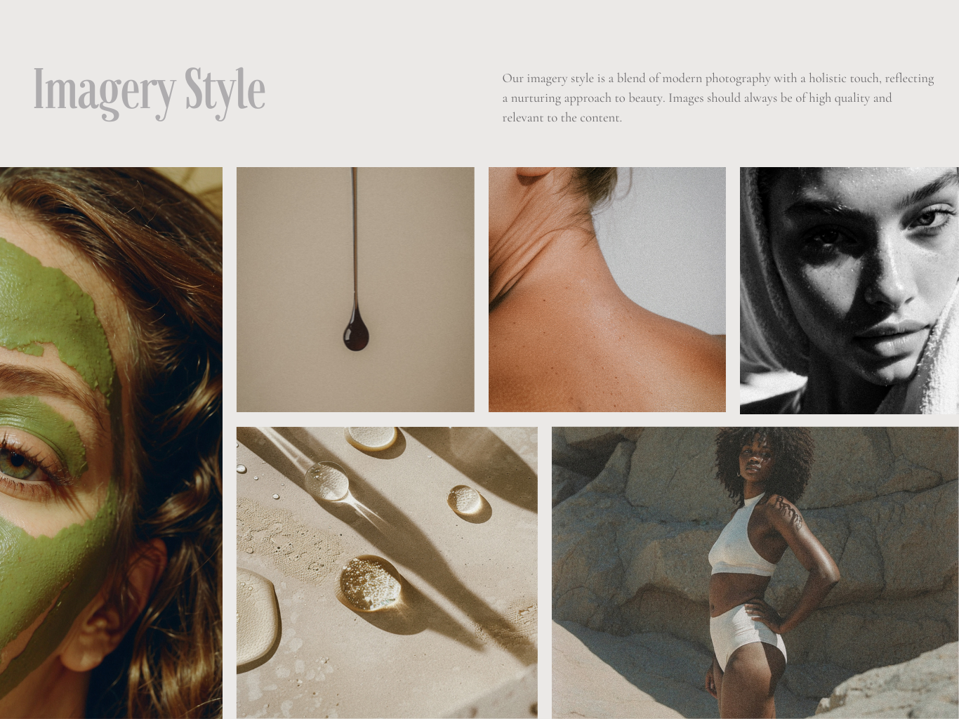
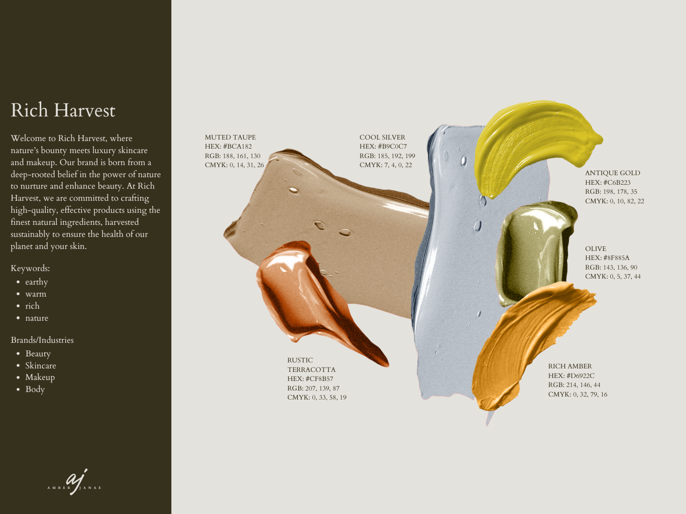
A complete brand identity system was developed over 12 weeks, starting with the foundation. Logo design with primary and secondary marks and variations for different applications. A color palette that held the tension between warmth and refinement without resolving too quickly into either. Typography with editorial sensibility. Product packaging concepts and digital touchpoint guidelines, every element developed with the same intentionality as the brief itself, so nothing felt retrofitted.
The OutcomeA brand identity that feels as considered as the products it represents. The visual language doesn't announce itself — it simply coheres. Which, in the beauty and skincare space, is exactly the difference between noticed and remembered. The system travels across touchpoints without losing integrity.
"She took my loose vision and turned it into a refined, cohesive presence. Every element feels intentional — because it was."
( Client Feedback)-
![]()
"Working with Amber on the brand identity was transformative. She took my loose vision of creating a skincare brand rooted in authenticity and turned it into a refined, cohesive presence. Every detail, from the logo to the color palette—felt intentional and aligned with what I imagined. The process gave me so much clarity and confidence stepping into this new chapter."
— Client Feedback
-
![]()
"Amber’s approach to brand identity is unlike anything I’ve experienced. She didn’t just design a logo; she built a world for my brand. The new brand identity feels elegant, modern, and timeless, while still deeply connected to nature. I finally feel like my brand tells the story I’ve always wanted to share."
— Client Feedback